Increasing Affordance for Drag & Drop Interactions when using React-DnD
Published September 17, 2023
Discover the importance of affordance, the challenges of poor affordance, and how to provide clear guidance to users through code implementation.
- Understanding Affordance
- The Importance of Affordance in Drag and Drop
- Poor Affordance: The User's Dilemma
- Better Affordance: Providing Clear Guidance
- Implementing Better Affordance: The Code
- Conclusion
- References
Have you ever encountered a situation where you were unsure how to interact with a digital object? Maybe you struggled to figure out where to drop a component or were misled into thinking you could add it in a certain place. This lack of clarity is a result of poor affordance, which can lead to frustration and confusion for users. In this blog post, we will explore the concept of affordance and discuss how to increase it when using drag and drop interactions.
Understanding Affordance
Affordance is a property or feature of an object that presents a prompt on what can be done with it.
In the context of user experience (UX), affordances are cues that give users a hint about how they can interact with something, whether it's a physical or digital object. For example, when you see a door handle, it prompts you to use it to open the door. Similarly, when you see a receiver icon, it suggests that you can click it to make a call. Affordances make our lives easier by supporting successful interactions with the physical and digital world.
The Importance of Affordance in Drag and Drop
Drag and drop interactions are commonly used in various digital applications and interfaces. They allow users to move elements, rearrange content, and perform actions by simply dragging and dropping items on the screen. However, without clear affordance, users may struggle to understand where they can drop a component or what actions are available to them.
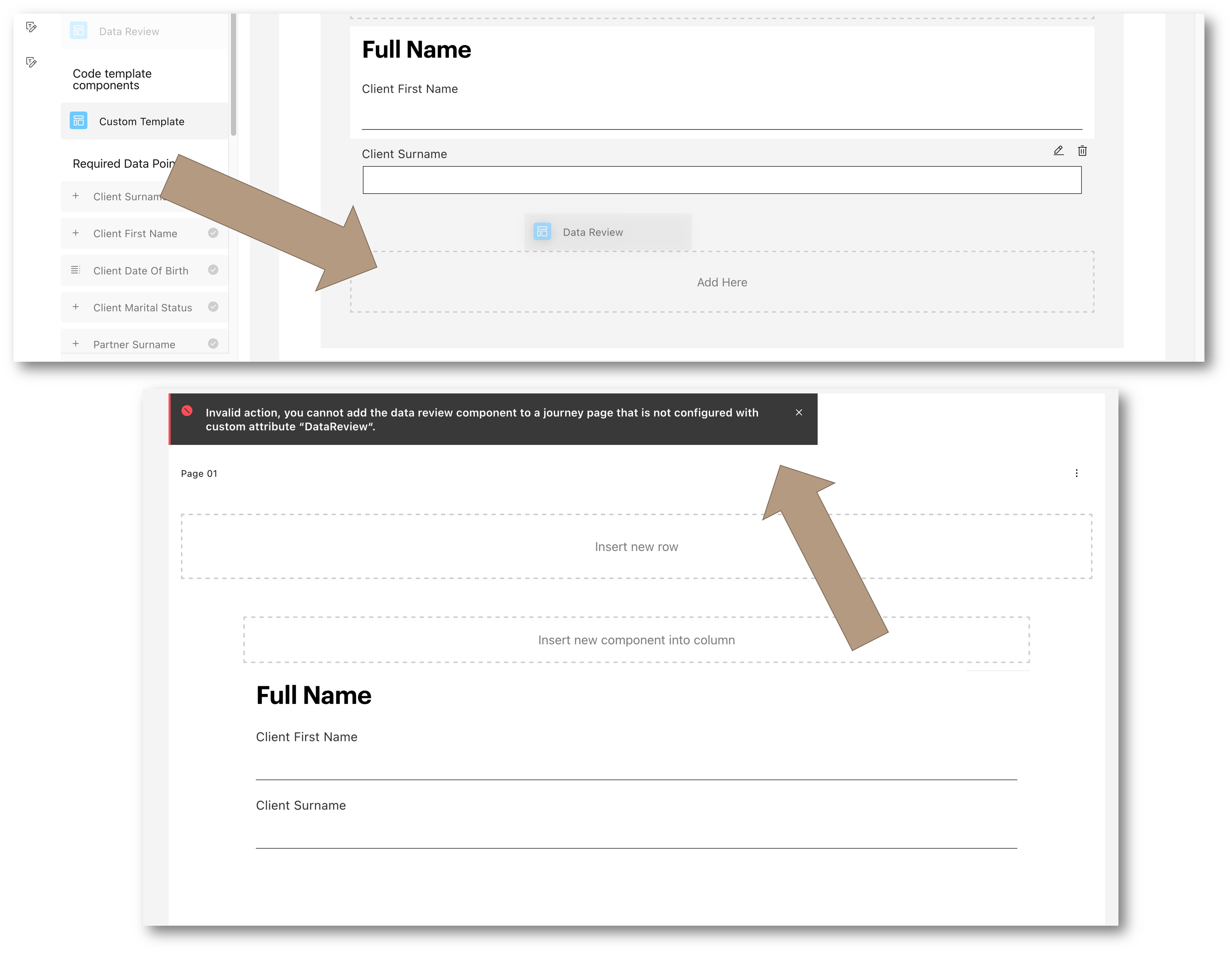
Poor Affordance: The User's Dilemma
In the case of poor affordance, users are left in the dark about where they can drop a component. They may be misled into thinking they can add it in a certain place, only to realize their mistake after they have already dropped the component. This can result in wasted time, frustration, and a negative user experience.
Better Affordance: Providing Clear Guidance
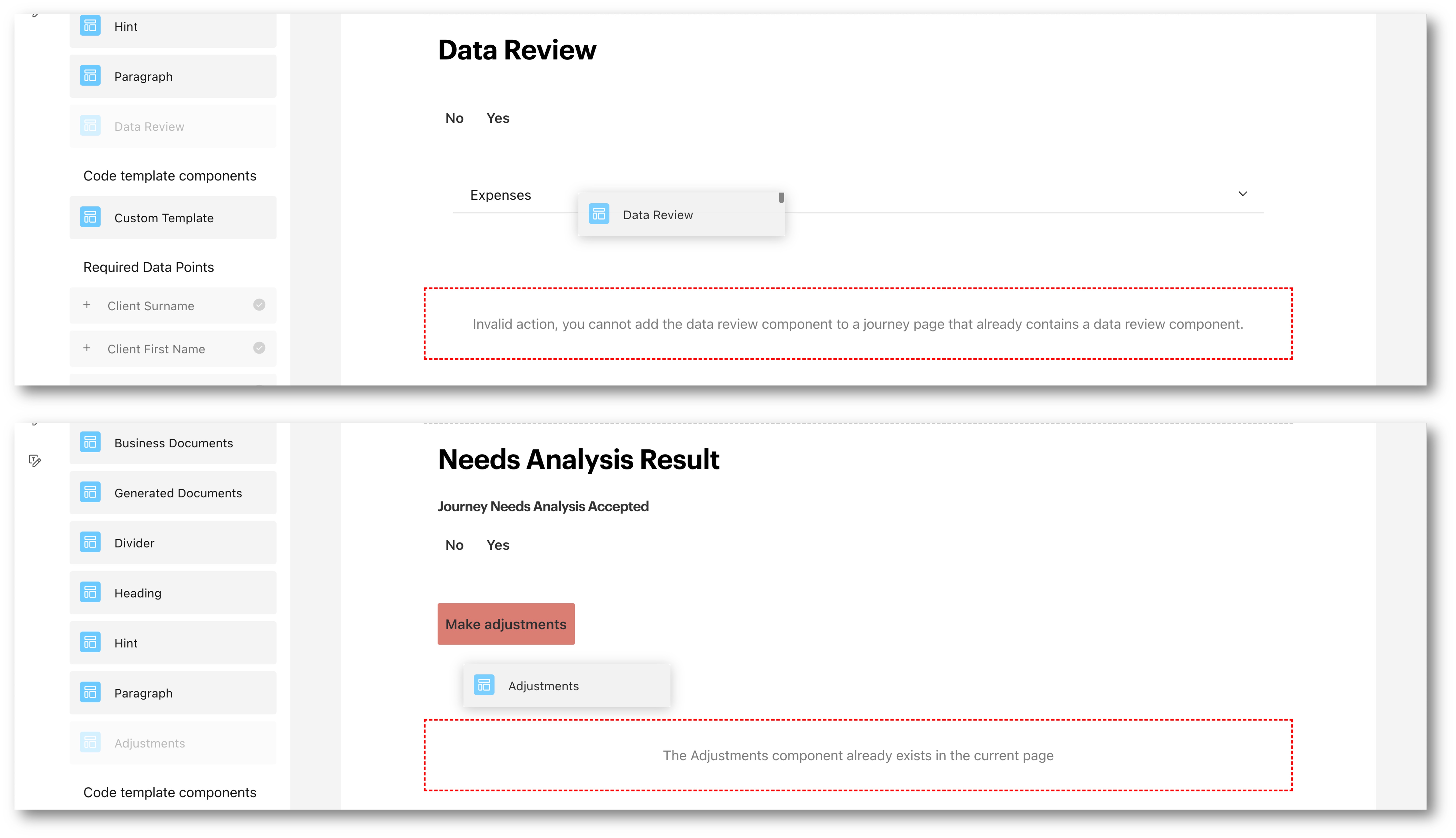
To improve affordance in drag and drop interactions, it's essential to provide clear guidance to users. By visually indicating where a component can't be dropped and explaining the reason behind it, users can make informed decisions and avoid unnecessary mistakes. Now the user immediately sees where the component can’t go, and the reason why.
Implementing Better Affordance: The Code
Let's take a look at how we can implement better affordance in drag and drop interactions. We'll explore the changes made to the code to enhance the user experience.
The Old Way
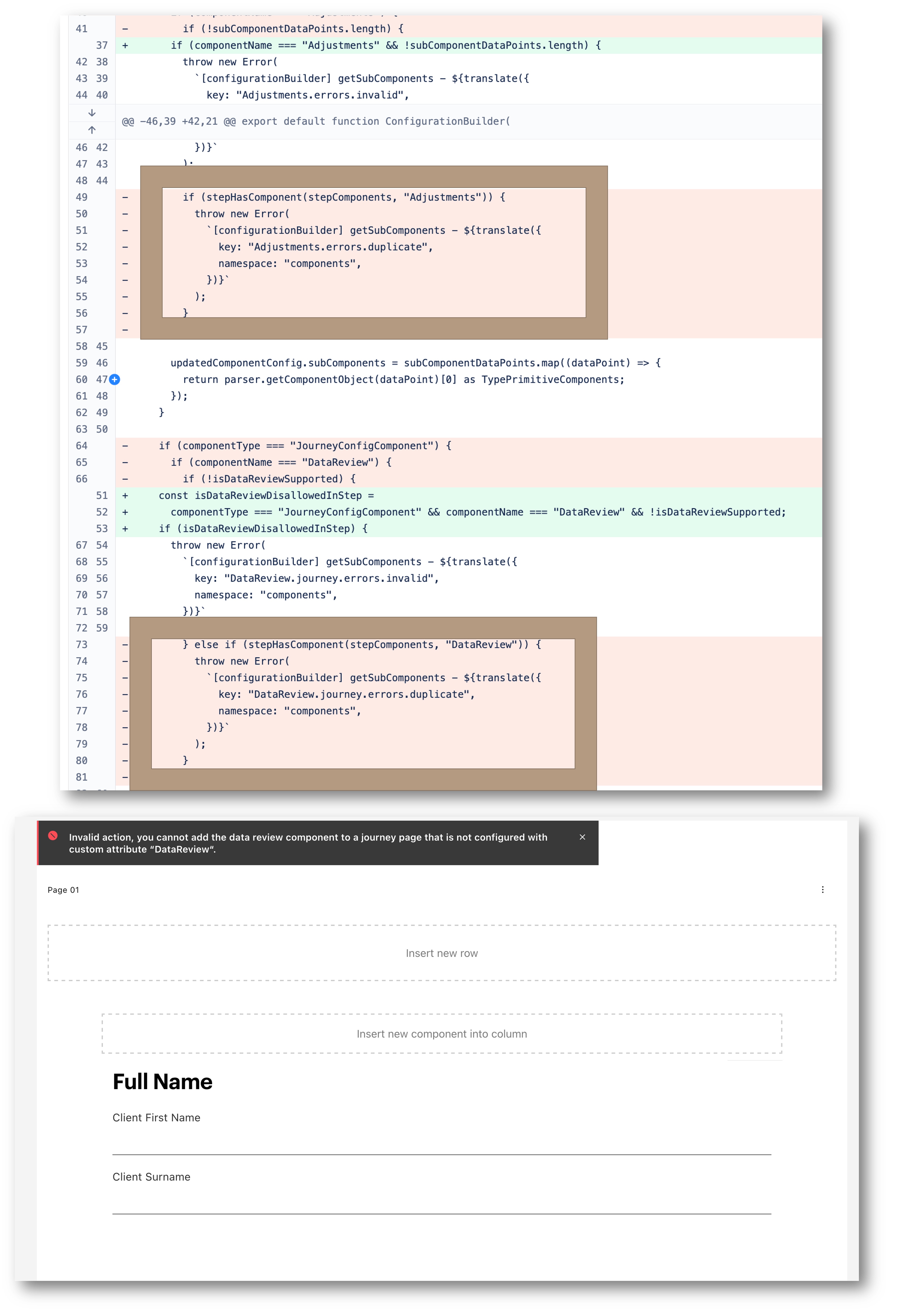
In the previous approach, the code checked the stepHasComponent method and threw an error if the component was already present. However, this approach was not very scalable, as it required a new statement for each component and its requirements.
The New Way
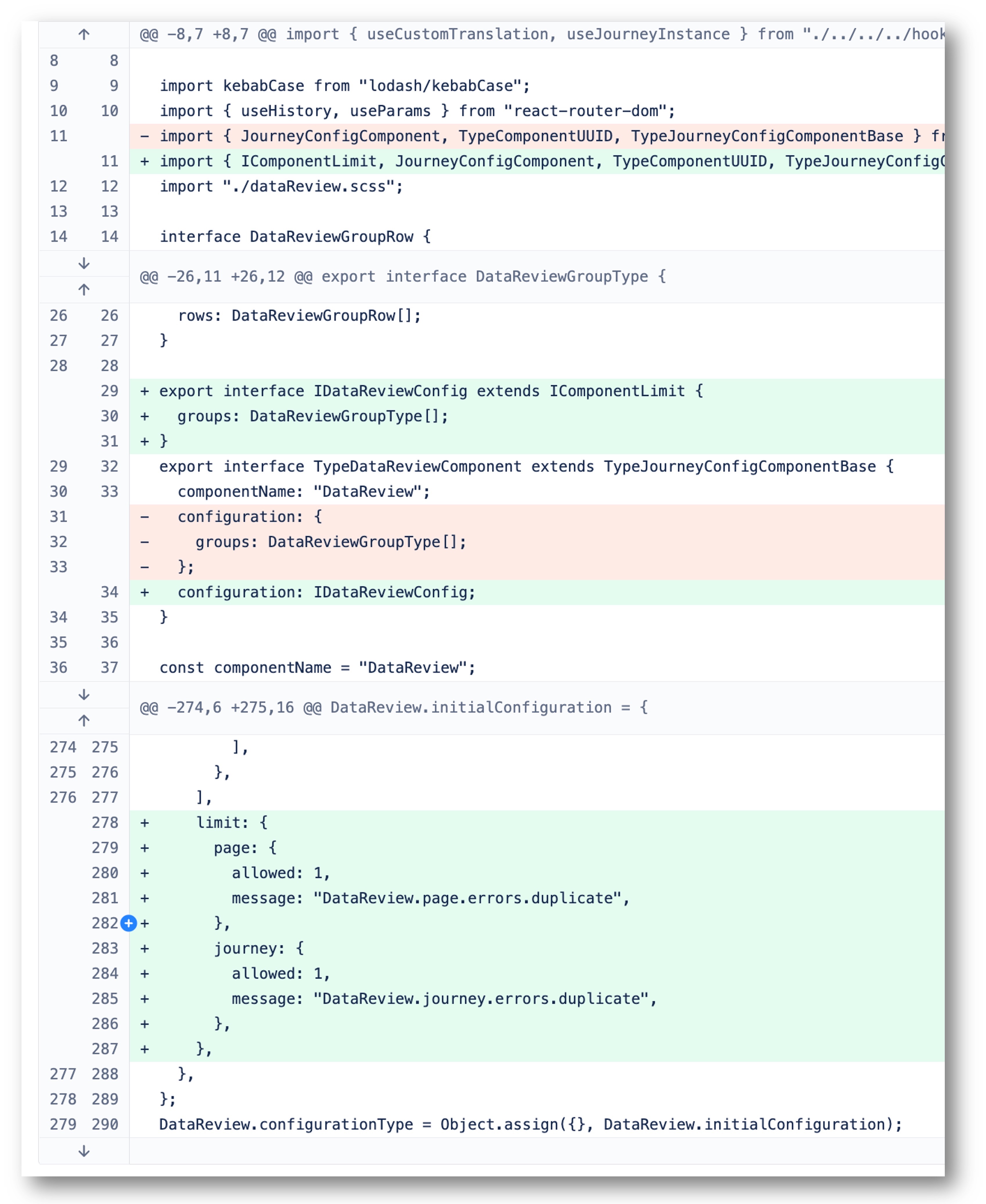
In the new approach, we have made improvements to the code to provide better affordance. By adding the IComponentLimit interface to the component config, we can manage the drop behavior more effectively.
export interface IComponentLimit {
  limit?: {
    page?: {
      allowed: number;
      message: string;
    };
    journey?: {
      allowed: number;
      message: string;
    };
  }
}
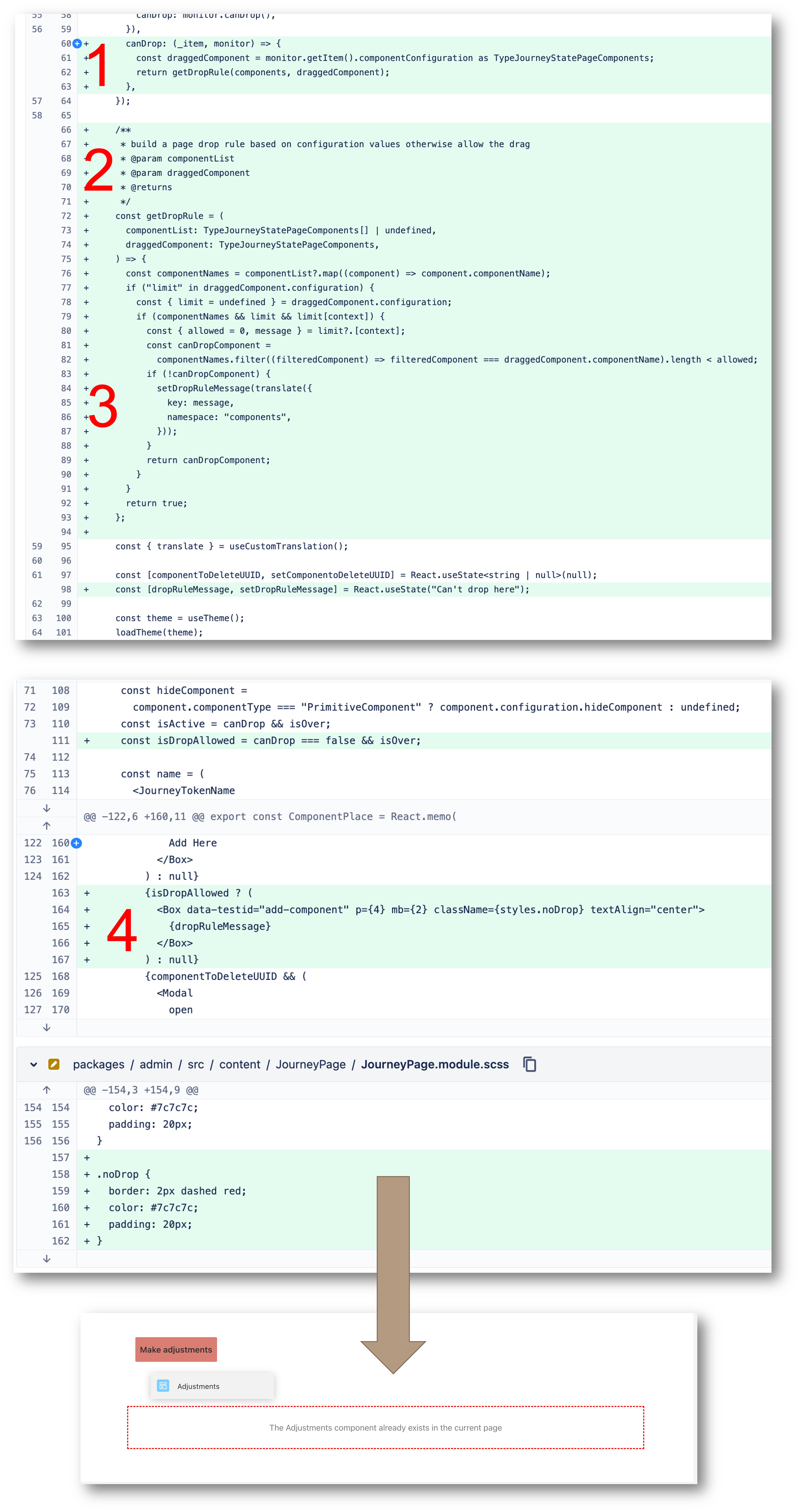
In Experience Manager, we can use the canDrop property to specify whether the drop target is able to accept the item. This is useful if you want to disable dropping based on certain conditions. The getDropRule function returns the condition based on the presence and contents of the IComponentLimit on the component config.
Additionally, the IComponentLimit contains the error message displayed when a drop is not allowed. We can extract, translate, and set the appropriate message based on the canDrop and isOver booleans to determine if we should show the relevant error message.
Conclusion
Affordance plays a crucial role in user experience design and can greatly impact the success of digital products. By increasing affordance in drag and drop interactions, we can enhance the user experience and reduce confusion. Clear guidance and visual cues help users understand where they can drop components and avoid making mistakes.